Elevation
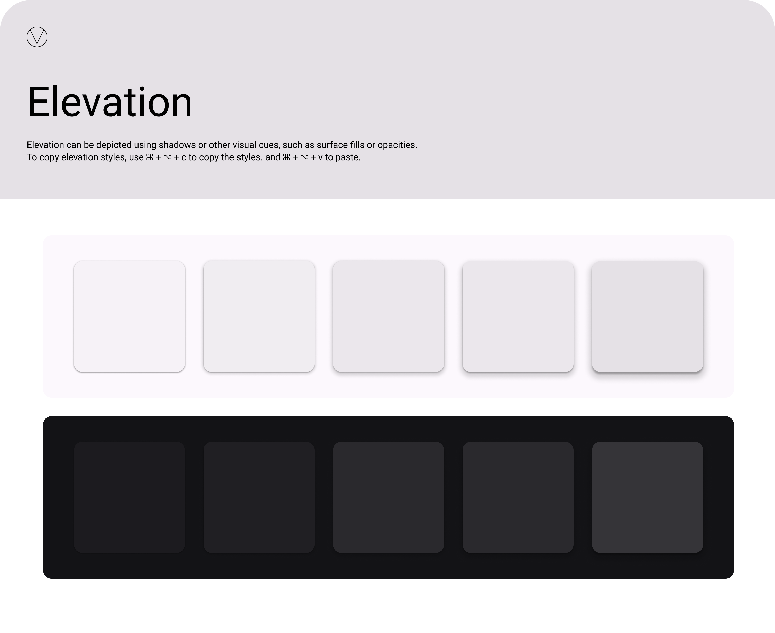
Elevation communicates hierarchy — what's in front of what. OCL uses the MUI v5 default elevation scale,
which is based on Material Design's 25-level shadow system. In practice, TBv3 today only uses level 1
(via Paper elevation={1} and the :hover lift on cards).
Per the April 2026 review, the Elevation Zeplin design lists all levels
but "the first one is used, that's it." Use level 1 for raised panels, hover states, and
interactive cards. Reach for higher levels only when a floating UI element needs to visually break out
of the page flow (e.g. dialogs, popovers, tooltips).
Scale
0 · flat
1px border instead
1px border instead
1 · default
✅ used in TBv3
✅ used in TBv3
2
4 · app bar
8 · menu, snackbar
16 · drawer
24 · modal
Usage
| Level | MUI component default | Use for |
|---|---|---|
0 | Flat surfaces | Inline panels, table rows — use a 1px border instead. |
1 | Paper, Card | Raised content, hover states, the default for anything that needs to feel clickable. |
2 | — | Rarely needed in TBv3 today. |
4 | AppBar | Top navigation when content scrolls behind it. |
8 | Menu, Popover, Snackbar | Floating menus and transient notifications. |
16 | Drawer | Side drawers that temporarily overlay the page. |
24 | Dialog | Modals that pin focus. |
Reference
- MUI elevation reference: mui.com/material-ui/react-paper
- Zeplin source screenshot: designs/Elevation.png